|
|
Post by +CinnamonPelt+ on Jan 10, 2009 17:09:58 GMT -6
Not sure what Critique means? I'll tell you; Its where someone post a peice of art, and another person posts saying how it can be improved.
In this case i will be helping those extreme artists-in-the-making improve thier already awesomeness art!
Don't worry. Critique's aren't mean. that would make us Critics Theres a pretty big difference there.
So, Don't be afraid! i don't bite! ^_^ [/center] |
|
|
|
Post by .xXMorningstarXx. on Jan 10, 2009 19:58:11 GMT -6
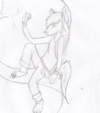
 I'm a little bit better now, i drew this in November but 2 months makes a BBBIIIG diff 4 a person who changes their drawing style often! |
|
|
|
Post by +CinnamonPelt+ on Jan 11, 2009 7:14:24 GMT -6
AWW! tats a REALLY cute drawing! ^_^ your style is almost chibi! I can give you a few things to work on with this; I) The arms/shoulder/ upped body (not head) the shoulders are wide apart, therefore, the arm on the left should be further out to the left, to match its shoulders.The other arm is almost perfect! But it looks a bit tense, notice it is very close to/against the body. Your cats facial expression is relaxed, so make the rest of him/her look relaxed ^_^ having the right arms so close to the body makes him/her look tense, if it's not intended, move the arm out a little (: II) chest The chest makes the top half of the body look like its seperate from the rest, this is because it has no merge, it hangs down a bit too low. try drawing only half of the chest fur, like this;  Oh yeah, in that photo, i didn't draw the head separate, it doesn't matter either way; your head is drawn the way that suits the rest of your drawing (: That's all for nowI hope it helps you (i didn't draw hair because that's not my style... i forgot.. sorry!^^') |
|
ravenclaw
Mature Apprentice
 [M:-8]
%%The Mysterious Night%%
Posts: 71
|
Post by ravenclaw on Jan 27, 2009 10:51:10 GMT -6
|
|
|
|
Post by ♥||Ripples\\*♥* on Mar 20, 2009 16:07:55 GMT -6
 Here I made that story in the writing and I drew that cat, kitten. My newest edition to my charries : EBONYKIT! The pic above has been editied by me on Photo Bucket.com. The one below hasnt been editied.  Here are some other pictures by me that I found on paint. (BTW: These are from a while ago. I change my style often, but not as much as Mosiac most likely.)      Mind you these are really old kind of. Like maybe a few months, some i colored using my pencils other I used photo bucket, or didnt color. I think none are on paint maybe some might. However, I have improved my drawing since these. I just wanted to see what you'd say. |
|
|
|
Post by +CinnamonPelt+ on Mar 20, 2009 16:28:38 GMT -6
Overall i think theyre really good! especially teh wolf in chains, like i told you ahaha  For the first two, you may be expecting this, but the lower part is a bit big, i know he's got a tail and all, but his but is expanding x3 to get rid of this, simly make your cat more streamline, and make the knee?/leg? a bit lower down. And the features less mouse-like, make the nose less pointy and bring the mouth up. oh, if you're drawing a kit, the eyes and paws are normally bigger, and the tail is shorter.  The next one i beleive is the darklost one right? All that really is slightly out on this one is the hind leg on the far side of the body, it is the same. just make the knee thing smaller (do you get what i mean by that? XD). also on the hind leg, where the heel thing sticks out, define that more, so the legs wont look as wobbley. Anthros  something i love but uber suck at. all that can be improved here is the length of the limbs, and how they fit the body. The anthro with one leg up has really short arms. i would have drawn her bending her arms, so her elbows almost touch the ground. the wolf is basically perfect, you gotta work on the same thing as me, the face xD theyre tricky huh. i love it though, GET DEVIANTART  LOL AT MY ANTHRO  |
|